- The Discount Newsletter
- Posts
- The Inverted Yield Curve: Harbinger of Gloom & Doom
The Inverted Yield Curve: Harbinger of Gloom & Doom
If you could only rely on one economic indicator to predict recessions and market crashes, what would you pick?
The Discount Newsletter
June 18, 2023
The Inverted Yield Curve: Harbinger of Gloom & Doom

Welcome to The Discount 💰 Dive deep into financial markets with us every week.
If you could only rely on one economic indicator to predict recessions and market crashes, what would you pick?

Would it be Copper? That wouldn’t be a bad choice.
After all, copper goes into everything from piping to electronics. When its price is rising, the economy is usually in good shape. When it’s falling, it’s time to pay attention.
What about the lumber-to-gold ratio? This trusty indicator can also tell us ton about the state of the economy.
These are both incredibly useful and a part of our tool kit at The Discount.
But the Pound-for-Pound Knockout Champion in predicting recessions and market crashes is….
The Inverted Yield Curve.
…and quite honestly, it’s not a competition.
An Inverted Yield Curve is the most proven economic indicator. Since World War II, EVERY single Inverted Yield Curve has been followed by a recession. Typically, within 6-18 months.
In a second, we’ll tell you everything you need to know about the yield curve, how markets performed following one, where we are today and what we can expect in the next year or two.
But we want to first welcome you to The Discount Weekly. Each week, we dive into the biggest issues facing traders and investors… and how they impact your portfolios.
So, let’s address the elephant in the room…
What the hell is a yield curve?
A yield curve is a measure of the largest and most important market in the world: The Bond Market.
It measures the spread, or difference, between the yield on two bonds with different maturities. The most popular compares the spread between the 2 year and 10-year US Treasury yields.
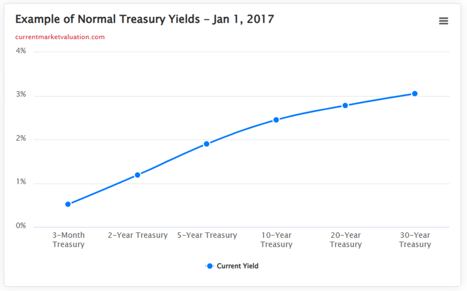
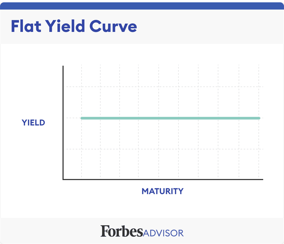
A yield curve can be normal, inverted, or flat.
When a yield curve is in a normal state, longer term bonds pay more than shorter term bonds… as they should. The further you go out into the future the more uncertainty.
A flat or flattening yield curve is when you should start paying attention.... This means investor uncertainty is increasing and demand for longer term bonds is on the rise.
When a yield curve is inverted, shorter term bonds are yielding more than longer term. This happens when investors are uncertain or nervous about the future. They are expecting short term rates to fall and The Fed is going to have to cut rates to stimulate a flailing economy.
So, investors pile into longer-dated bonds to try and lock in the best, highest rate for as long as possible. This in return, drives the longer term bonds down and the short term bonds up. Supply & demand.

The chart above shows the current yield curve today. As you can see, we are heavily inverted and have been so since July 2022… almost a full 12 months now.
This is a huge red flag for the economy.
To understand why it’s such a huge red flag, let’s look at each Inverted Yield Curve as it relates to recessions and S&P500 performance.

This chart of the S&P500 above dates to 1965. The grey shaded areas are recessions. The blue represents when the yield curve was normal. The red represents when the yield curve was inverted.
As you can see very clearly, the red periods (inversions) are rare occurrences and lead to economic downturns shortly thereafter.
So what?
Let’s zoom in on the chart above and take a look at each inverted yield since 1965 through 2023…and how the S&P500 performed following each inversion.
Each time period typically represents generational buying and selling opportunities with drawdowns of 30% - 60%+ in the S&P500.
Mind you, a normal correctional period for the S&P500 is 10-20%.
First Up: 1965 – 1972

After the first brief inversion, markets melted up 50% and peaked within 24 months. While not a very prolonged inverted yield curve like we have today, it was flashing warning signs and foreshadowing the approx. 40% correction from top-to-bottom in the S&P500.
Next Up: 1972 – 1976
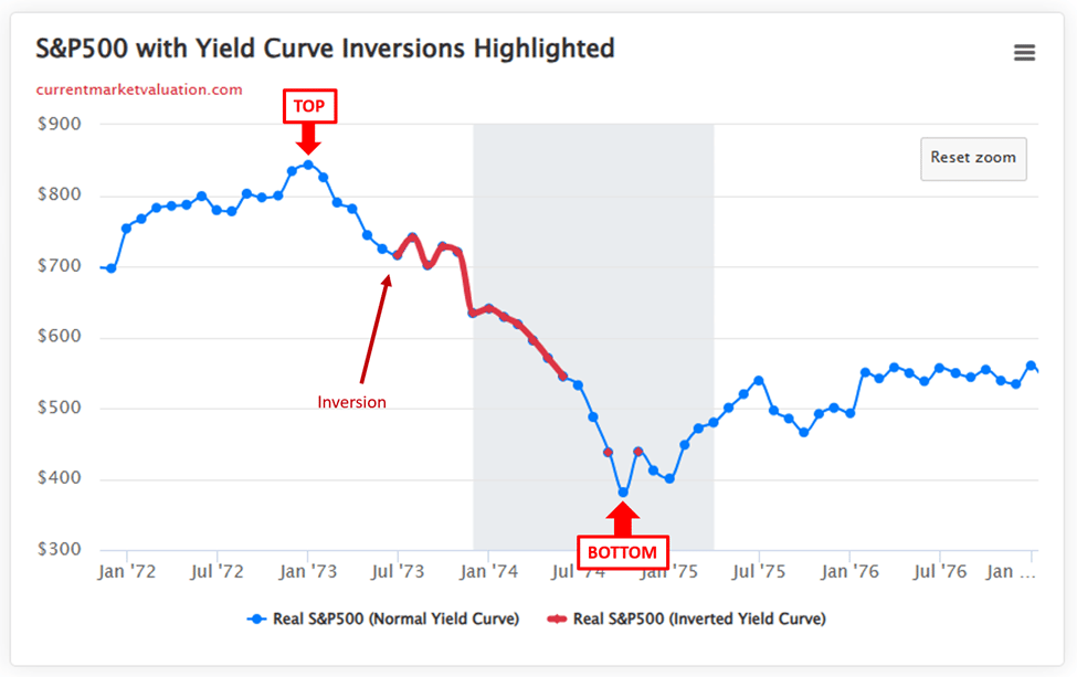
Nothing is perfect, and that goes for the inverted yield curve in June 1973. As you can see, the complete inversion was a bit late to tell investors something was wrong. But nonetheless, it told you.
The S&P500 corrected 55% from peak to trough and the market continued to go nowhere but sideways-to-lower for 10 years…
Next Up: 1976 - 1984
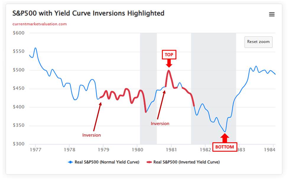
The late 1970’s into the early 1980’s is what most consider “the beginning of the debt cycle” that we are currently rampant in today, and what most are arguing might be coming to an end soon through potential cataclysmic global market collapse.
We will go over all of that in a subsequent weekly edition i.e. Fed Policy, government spending, consumer debt and how this impacts your portfolios.
For today’s purposes, notice how this is a funky looking period. It looks like an EKG…
Keep this in mind as we continue to move closer and closer to the present day…
You’ll see a pattern where we can argue the inverted yield curve has only continued to become increasingly accurate and relevant to market crashes since this time period, with each new inversion.
Perhaps a direct correlation to the prevalence and impact interest rates and debt has on our current system.
Between the first inversion in November 1978 and the bottom in 1982. The market corrected 26%... if you measure between the two recessions, 1980 – 1982 the market corrected 34%.
Things start to get clearer from here…
Next Up: 1988 - 1992
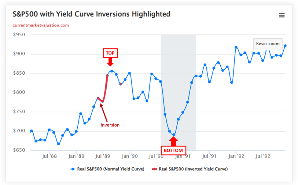
Things are starting to look cleaner on the charts as we move into the great Millennial age.
The yield curve inverted in May 1989 and went back to normal in August 1989. After the inversion was over, we witness the top of the market directly after.
While not a massive drawdown, the S&P500 still corrected 20% from peak to trough during this recession.
Note this as we move on: when the inverted yield curve flipped back to normal / flattened, that was your sign to either get out of the markets, get defensive and/or stay patient for buying opportunities.
This trend continues… watch this.
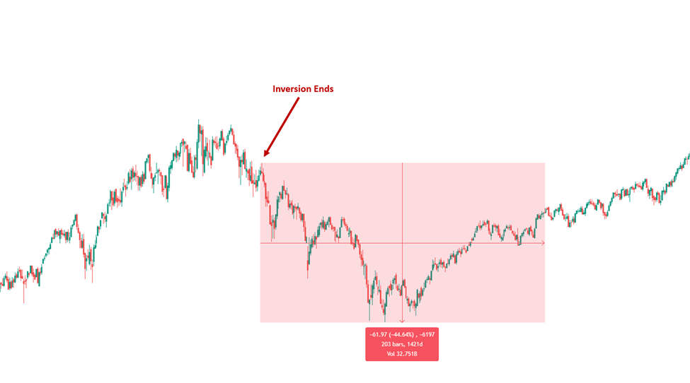
Next Up: 1995 – 2003

Party like it’s 1999…. Ah, the 90’s… limited technology and great tunes. When you had to walk over to your friend’s house if you wanted to say hello.
The S&P500 went on a massive bull run nearly tripling gains from 1994 to Dot Com peak.
So that little, previous inversion back in 1989? The market bottom that followed was quite the generational buying opportunity.
But that sweet 90’s music stopped in 2000…
From peak-to-trough in the Dot Com Bust, the S&P500 corrected an approx.. 50%.
The Nasdaq went on to fare far, far worse. As a risk-on index, the Nasdaq corrected a whopping 80% and didn’t reach those highs again for almost 20 years.
So, as you can tell, the inverted yield curve predicted the market correction to almost perfection.
Sure, if you waited for the inversion to end, to put your 401k in cash or get defensive with other plays, you lost a bit from the previous top.
But you saved yourself a lot more hardship… check this out.
Here is a chart of the S&P500 once the inversion ended, and how much it continued to correct.
And… The Nasdaq
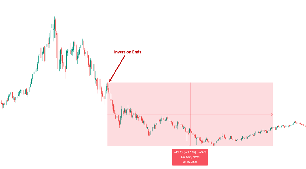
Next Up: 2004 – 2012

Timed to perfection… The Great Financial Crisis of 2008.
The inverted yield curve first inverted in July 2006, and went back to normal in April 2007.
7 months from when the inversion ended, we witnessed the peak of the market which was not reached again for almost 10 years.
In total, the S&P500 corrected over 60%
Enough said.
Next Up: 2017 – 2021

Almost again, timed to perfection. However, we argue that COVID was a black swan event, which pushed out the real recession (the one we are in / about to be in now) because of the historic quantitative easing by The Federal Reserve and government stimulus.
While it was only briefly inverted, it is worth noting that if you took some notice after the first inversion ended… you had a massive opportunity with the COVID drawdown and the subsequent buying opportunity across all assets, that we’re all too familiar with.
The S&P500 corrected approx. 30% in the COVID flash crash.
Last But Not Least: 2021 – Present

After the COVID flash crash we had a melt-up across all asset classes.
Then, the Fed began aggressively raising interest rates in March 2022 (and sold their own personal portfolios prior to that lol). The market corrected approx. 25% and now we have our current inverted yield curve which started officially in July 2022.
So, the million-dollar question: Was that the top?
Markets have rallied significantly from the October 2022 bottom and almost back to all-time-highs across the Nasdaq, S&P500, Dow Jones and Semiconductors.
So now that we know what History says…
Let’s summarize what to expect moving forward:
1. We could break all-time highs again and go on another bull run before the inversion ENDS. That would trap everyone at the top again, thinking the worst is behind us.
2. Once the inversion ends, we could see a top shortly after, and then significant market correction (40%, 60% even 80%).
3. That could have been the top in 2022… and that means there could still be a lot more pain ahead.
4. Watch for the inverted yield curve to flatten and then END.
5. If the S&P500 starts a new downtrend again AND the inverted yield curve ENDS – that’s a big sign that things may have topped and similar to the Dot Com Bust in 2000, there’s a lot more downside ahead.
6. Stay on your toes and be safe. Regardless “if it’s different this time”, I think it’s pretty clear whether it plays out as perfectly as 2008 or 2000, or if nothing happens at all, that an inverted yield curve represents turmoil.
But in short, once the inverted yield curve flips back to normal, you can expect a significant drop in the markets eventually, even if a correction has already happened.
What are we doing at The Discount?
We are going with our combination of common-sense technical analysis + macro indicators such as this. History says to wait until the inversion ends to get more defensive. During times like these, we like to wait for the fat pitch, keep some dry powder and stay PATIENT… hard to do, I know.
Also, we will be launching “The Discount Portfolio” soon, so you can track our trades in real-time, with common-sense analysis for each position we take. A service that anyone, from beginner-to-advanced, can understand and take advantage of.
Be sure to subscribe via email, if you haven’t already, to receive the notification when the portfolio launches.
For now, stay tuned and have a great rest of your weekend!
See You Next Sunday!